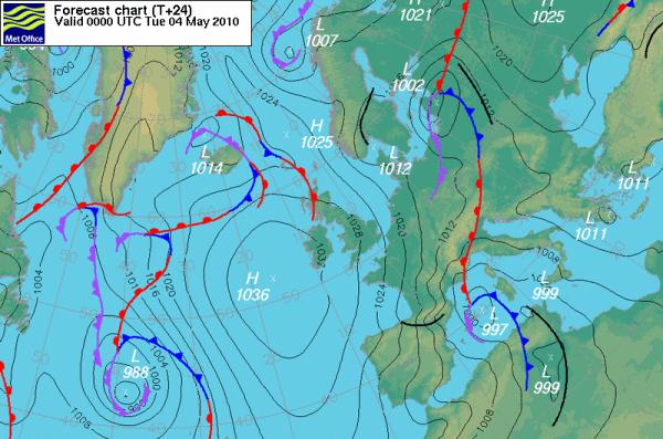
El synoptic map (or also called a synoptic chart) is a graphic representation of the atmospheric pressure field at mean sea level. The isobars that correspond to lines of equal pressure are drawn by meteorologists every 4 hectopascals in the meteorological services of some countries (top photo) and every 5 hectopascals in others (bottom photo). Apart from the isobars the chart shows the frontal systems and the high and low pressure centers.
Let's now see some basic elements that can be identified in the synoptic maps:
1. The Isobars
They correspond to the lines that join points of equal atmospheric pressure. The value of atmospheric pressure that represents each of them is indicated on the line. For example, in the black and white map the value of the isobar that crosses the Balearic Islands is 1025 Hpa.
2. Low Pressure Centers
They correspond to the layout of the more or less circular isobars around a center where the atmospheric pressure is minimum. They are usually marked with the letters B (squall) or L (low press), also with a T. They are normally associated with bad weather conditions, with rains and storms.
3. High Pressure Centers
They correspond to the layout of the more or less circular isobars around a center where the atmospheric pressure is maxim. Marked with an A (high pressure) or H (high press). They are normally associated with good weather.
4. The Cold Fronts
Marked by jagged lines in blue, they indicate the advancement of a mass of Cold air that causes general rains and drops in temperatures in its wake.
5. The Warm Fronts
Marked by lines bordered by semicircles in red, they indicate the advance of a mass of warm air that causes rains and rises in temperatures in its wake.
6. The Occluded Fronts
Indicated by a mixture of symbols of a warm front and another of a cold front and purple. They indicate the line of meeting between a cold front and a warm front. They are usually associated with heavy rains.

Source: wetterzentrale, Met Office
Putote, false information and made up fucking fool