
If you often see the weather forecast you may have heard of the word climagram. It is a tool widely used in meteorology to represent the two most used variables: rainfall and temperature. A climate chart is nothing more than a graph where these two variables are represented and their values are established.
Do you want to know how climate charts work and learn how to interpret them? In this post we explain everything to you completely 🙂
Characteristics of a climate chart

In scientific terminology it is more correct to call this type of graph as ombrothermal diagram. This is because "ombro" means rain and thermal temperature. However, for society in general it is called a climogram. The most important variables to describe a climate are rainfall and temperatures. Hence, these diagrams become so important in meteorology.
The data reflected in the diagram is collected at the weather station. The average values are represented each month to know the trend and that the data is significant. To record the trends and behavior of a climate, the data they must be registered for at least 15 years. Otherwise it would not be climate data, but meteorological data.
The precipitations express the total of the rains that are collected in the months divided by the number of years. In this way you can know the average annual rainfall of a place. As it does not always rain in the same way or in the same periods, an average is made. There are data that do not serve to establish a general. This is due to years that are too dry or, on the contrary, very rainy. These unusual years have to be studied separately.
If the appearance of very rainy years and other drier years is something frequent or cyclical, it is included within the climate of an area. The representation of the temperatures varies a little with respect to the precipitations. If there is only one curve, the average temperatures for each month are treated. This is added and divided by the number of years. If there are three curves, the upper one is the mean of the maximum temperatures, the middle one the total mean and the lower one the mean of the minimum.
Used tools
Most climate charts use the Gaussen aridity index. This index considers that there is a certain level of aridity when the average of the temperatures is greater than twice the average of the precipitations.
In this way, the climogram has this structure:
First, an abscissa axis where the months of the year are set. Then it has the ordinate axis on the right where the temperature scale is placed. Finally, another ordinate axis on the left, where the precipitation scale is placed and which is twice the temperatures.
In this way, it is possible to observe directly if there is aridity when the precipitation curve is below the temperatures. The climatic values they have to be significant to know the value of the measure. That is, you have to give other data such as the weather station, the total number of measured rains and the average annual temperature.
What the weather charts look like at the end may vary depending on the values. The most typical is the one that represents rainfall by means of bars and temperatures by a red line. This is the simplest. However, there are some that are more complex. It is about representing both rainfall and temperatures with blue and red lines, respectively. Details such as shading and coloring are also added. It is colored yellow for the most arid times. Blue or black stripes are placed in rainy seasons of less than 1000mm. On the other hand, in intense blue the months in which it rains more than 1000mm are colored.
Added information
We can add much more information to the climate charts if we wish. For example, adding more information can help us to know the climatic conditions that plants have to endure. This becomes very useful when contributing to agriculture.
The most complete climogram is called Walter-Lieth diagram. It is characterized by having both temperatures and rainfall represented with a line. It also has a bar under the months that indicates how often frosts occur.
The extra information that this diagram has that others do not have is:
- nT = number of years observing temperatures.
- nP = number of years observing rainfall.
- Ta = absolute maximum temperature.
- T '= mean of the annual absolute maximum temperatures.
- Tc = mean of the maximum daily temperatures of the warmest month.
- T = mean of the maximum temperatures.
- Osc = thermal oscillation. (Osc = Tc - tf)
- t = mean of the minimum temperatures.
- tf = mean of the daily minimum temperatures of the coldest month.
- t '= mean of the annual absolute minimum temperatures.
- ta = absolute minimum temperature.
- tm = mean temperature. (tm = T + t / 2 or tm = T '+ t' / 2)
- P = mean annual rainfall.
- h = mean annual hours of sunshine.
- Hs = safe frosts.
- Hp = probable frosts.
- d = frost-free days.
- The black area means there is excess water.
- The dotted area means that there is a water deficit.
In the Thornthwaite graph the characteristics of the climate are represented as a function of the water vapor balance.
Comment of a climogram

When we see the climate chart of an area, commenting on it and interpreting it is simple. The first thing we have to look at is the precipitation curve. That is where we indicate the total rainfall and its distribution throughout the year and month. In addition, we can find out what the maximum and minimum levels have been.
Now we turn to looking at the temperature curve. It is the one that tells us the mean temperature, the annual thermal oscillation and the distribution throughout the year. We can analyze the hottest and coldest months and compare temperatures with those of other years. By observing the trend we can know the climate of an area.
Mediterranean Climograph
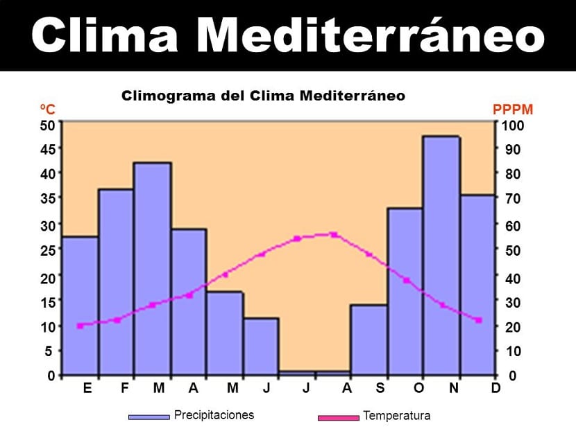
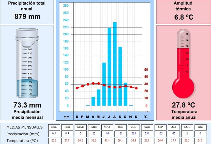
Our Mediterranean climate has average rainfall values and annual temperatures. These values are represented in the climate graph to get an idea of the data each year. It is mainly characterized by having low rainfall values in general throughout the year. An increase in rainfall can be observed in the winter and spring months, with two maximums in November and March.
As for the temperatures, they are quite mild. In winter do not drop below 10 ° C and in summer they are around 30 ° C.
Equatorial climate graph
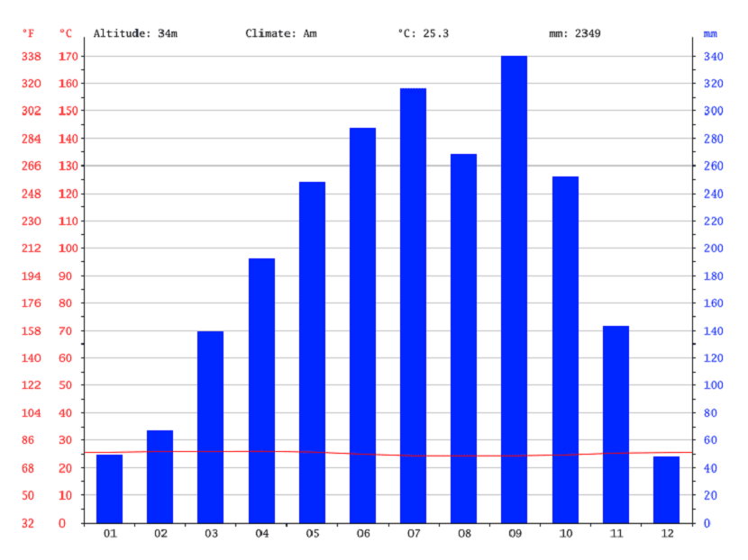
On the other hand, if we analyze the climate of an equatorial zone, we find different data. Precipitation values are high throughout the year, as is the temperature. You can observe maximum rainfall of more than 300mm and the temperature is maintained stable throughout the year around 25 ° C.
Tropical climate

In this case we find a climate of abundant rainfall, with maximums that are reached in the month of June and July. These rain peaks are due to the characteristic rains of this climate: the monsoons. During the summer monsoons take place that leave behind high levels of precipitation.
As for the temperature, it remains stable throughout the year at around 25 ° C.
Continental Climograph

We can analyze a case different from the previous ones. In this type of climate the temperatures are lower than in the previous ones. In winter they are below zero and in summer they do not reach 30 ° C. On the other hand, rainfall is in a normal regime.
Oceanic climate graph
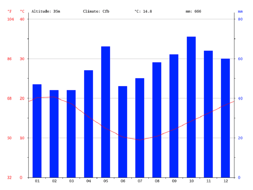
Here we find quite low rainfall values and a variable temperature. During the summer they are warmer. However, they drop sharply in the winter months. It is generally a fairly dry climate.
Polar climagram
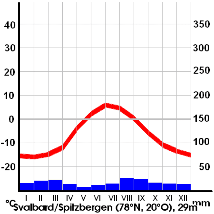
This type of climate is totally different from the rest. There are few levels of precipitation and most of it is in the form of snow and ice. Temperatures are very low throughout the year, so much so that they stay for a long season below zero degrees.
In this climate, the rainfall provides a great deal of information about the "history" of the place. When snow falls, it accumulates, forming layers of ice. Throughout thousands of years of accumulation, ice cores can be obtained that show us the history of the place in all these years. Large accumulations of snow are due to temperatures that do not allow it to melt.
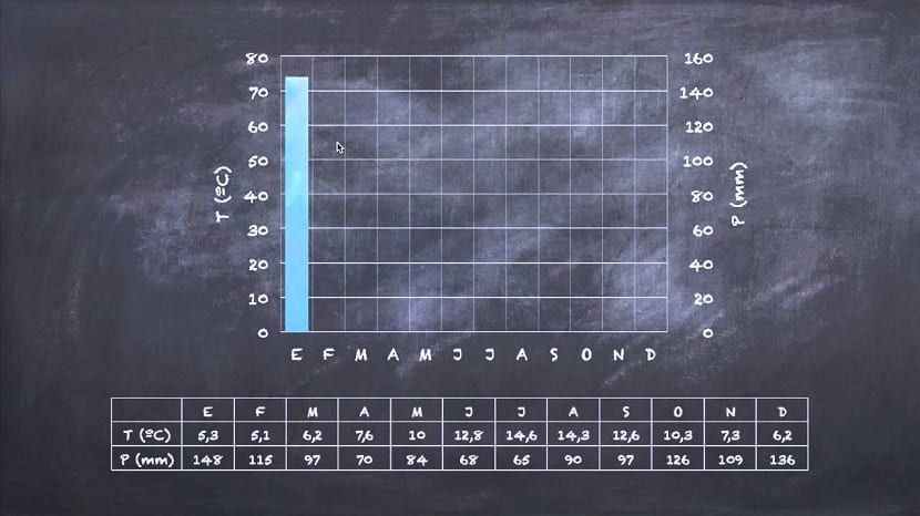
How to make a climate chart
In this video you can learn step by step how to make your own climate chart of an area:
I hope that with all this information you can analyze well the climates of any area of the world. You only have to stop to compare the levels of precipitation and temperature to know, in a general way, the climate of an area. Once we have known these values, we can delve into others such as winds and atmospheric pressure.
And you, have you ever seen a climate chart?